Talent Mentoring is a Pune based mentoring organization whose mission is to mentor global professionals, entrepreneurs, and students to develop their talent and achieve their dream.
UX DESIGNER
SEP - PRESENT
FIGMA
The Indian government estimates that up to 176 million young people in India are in need of care and protection. Many of these students don’t have access to positive role models, cannot envision a career, and don’t feel connected to their communities. It is tragic that these young people are much more likely to be unemployed or live in poverty. Mentoring creates meaningful connections that can positively impact the lives of both mentor and mentee.
I wanted to create a mentoring platform because being a mentee I always found it hard to keep track of my tasks and schedule assigned by my mentor. The mentor also found it hard to keep a track of the progress made by a mentee. This problem is particularly challenging as there aren’t a lot of platforms that cater to the needs of a mentor and mentee
We conducted a series of user interviews to figure out the process of mentoring and pain points that the users felt.
Goal
To get a detailed idea of the flow of how a mentor and mentee interacted
Outcomes
Gained valuable insights regarding the mentoring process
and learned about the users needs.
We conducted a series of user interviews to figure out the process of mentoring and pain points that the users felt.
Once we organized all our research and defined our solution, we began to explore potential designs for the website.
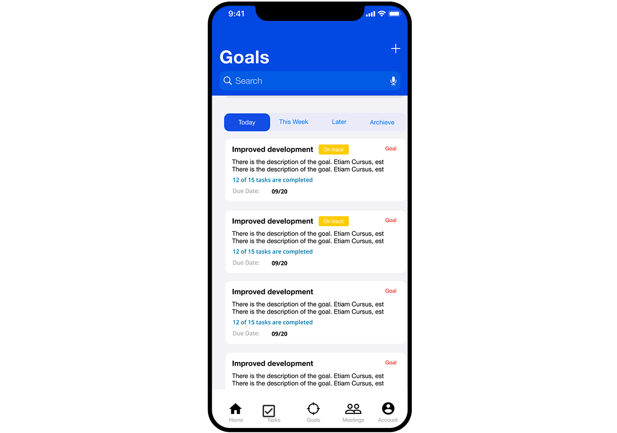
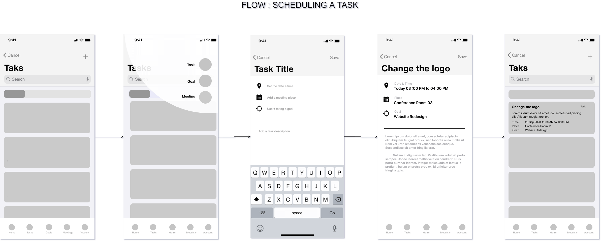
The plus icon on the top of every screen lets the users add new task, goals or meeting. Tapping the plus brings down a list of options to choose from. Tapping on the icon redirects to the appropriate screen
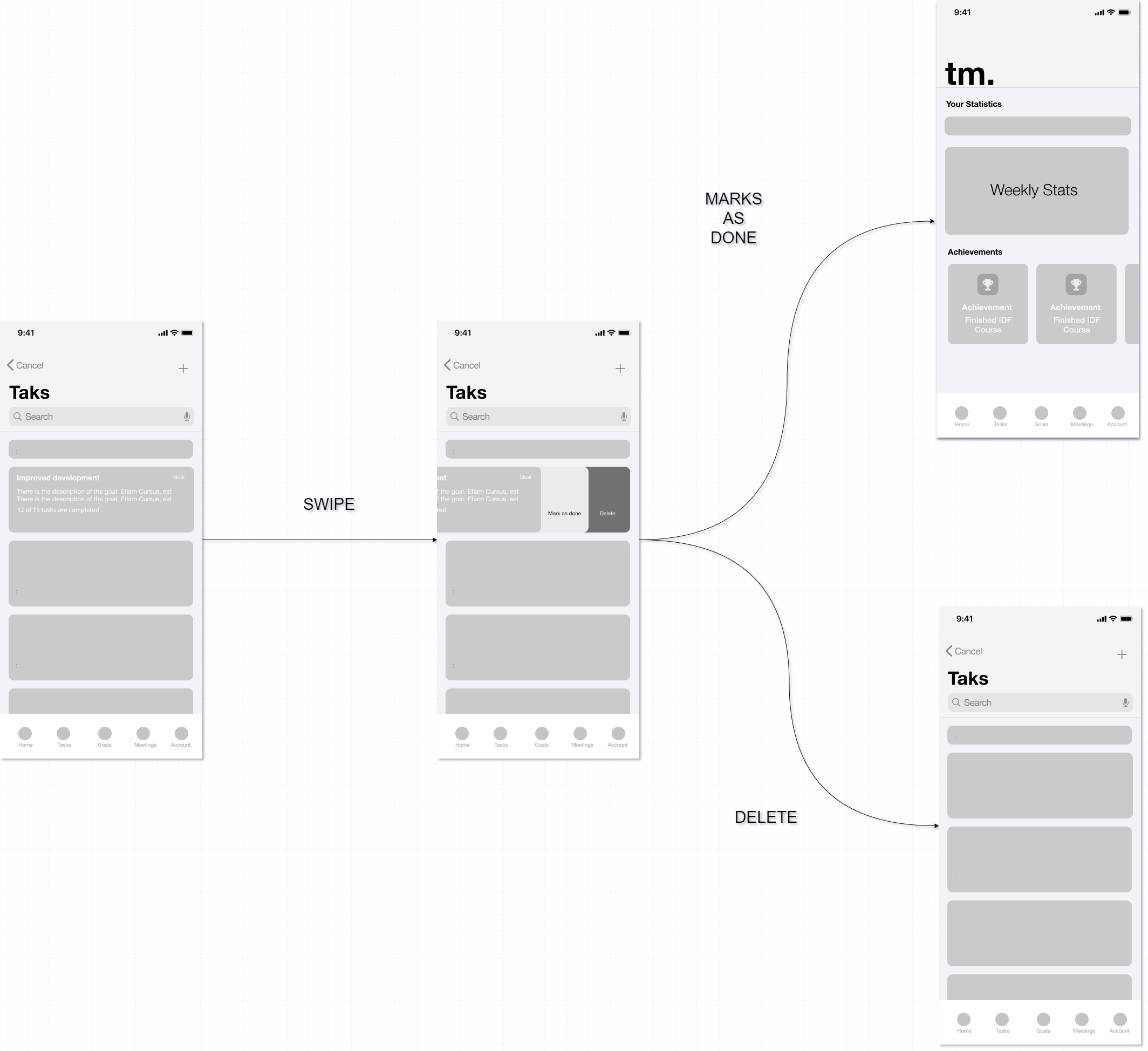
Task can be marked complete by swiping. Swiping it left brings up two options, one to mark the task as complete and the other to delete the task. Once the task is marked complete, it updates the stats page.
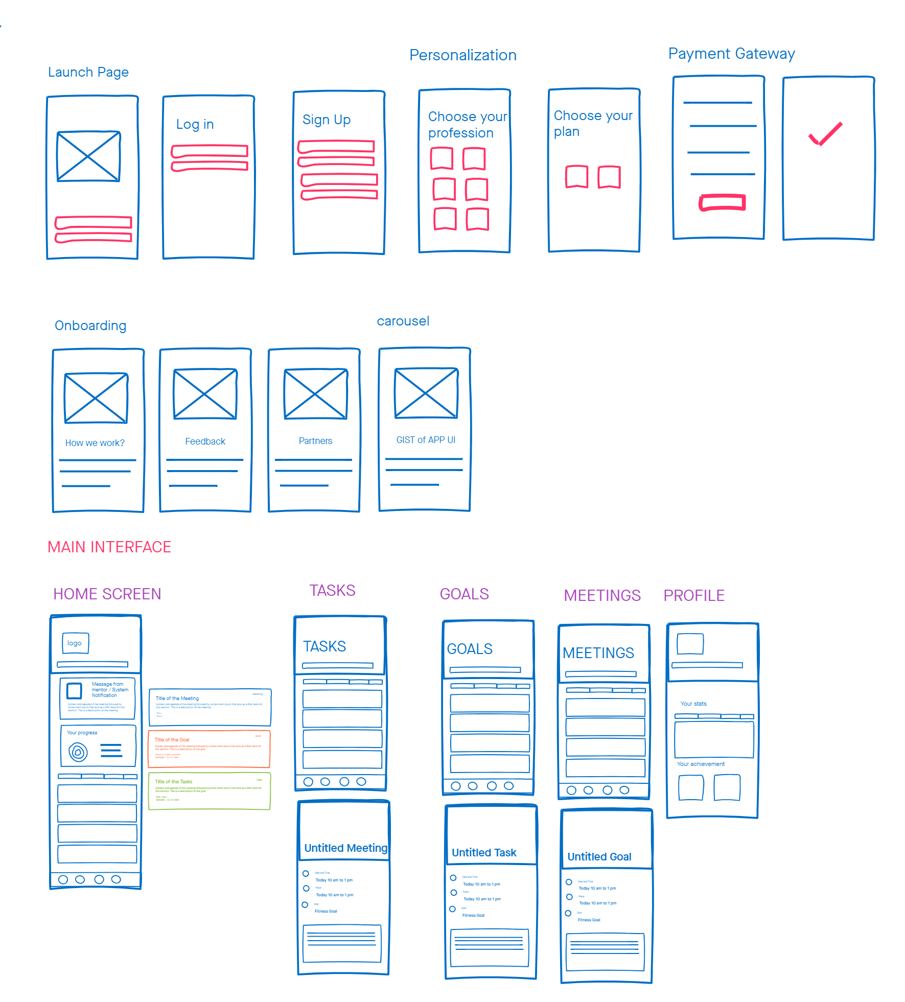
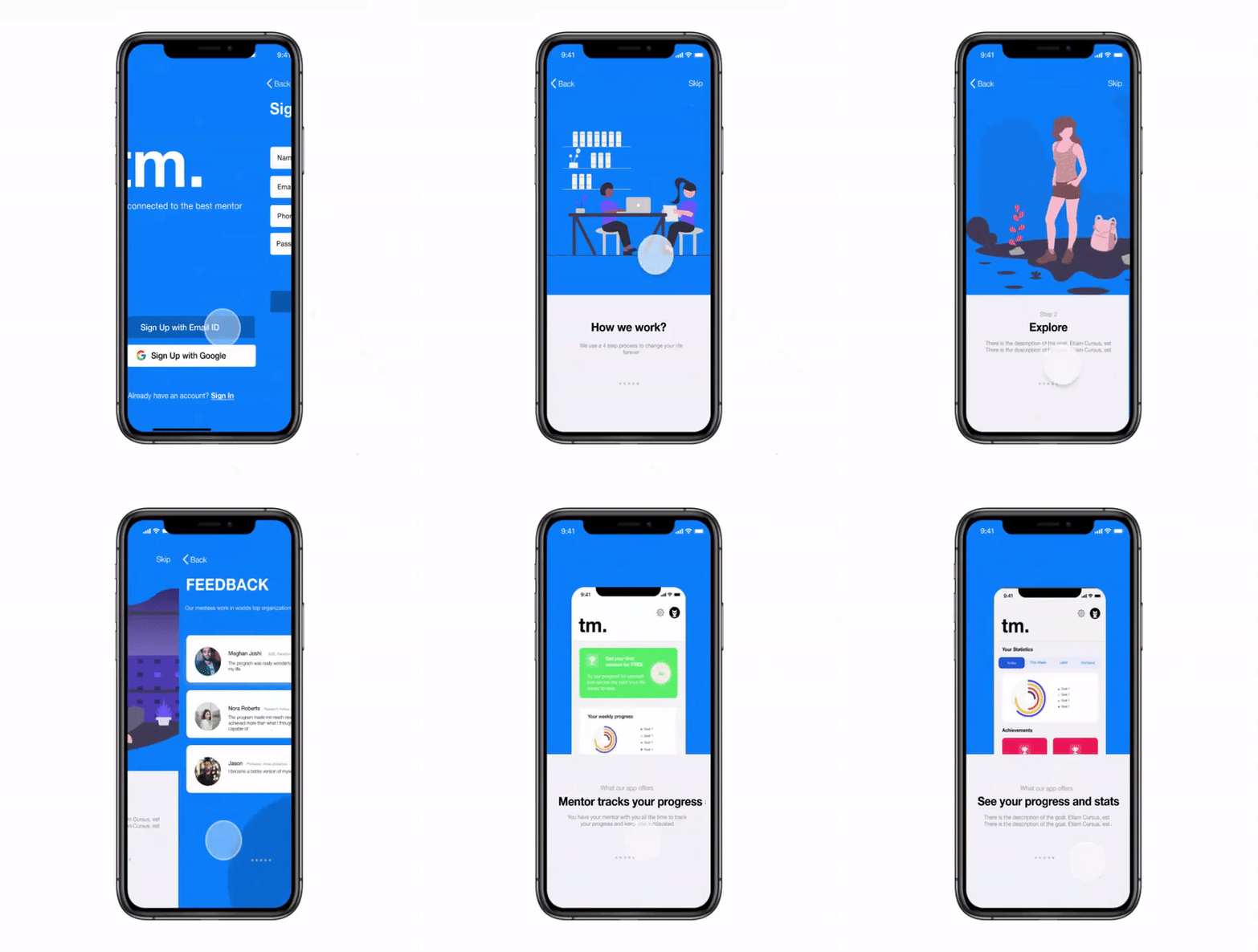
The onboarding process allows the users to know more about the program and how it works. It also has feedback from the alumnus of the program to increase the credibility of the program. The last few slides let the user know what to expect from the app. While going through this, the user gets familiarized with the app’s interface.
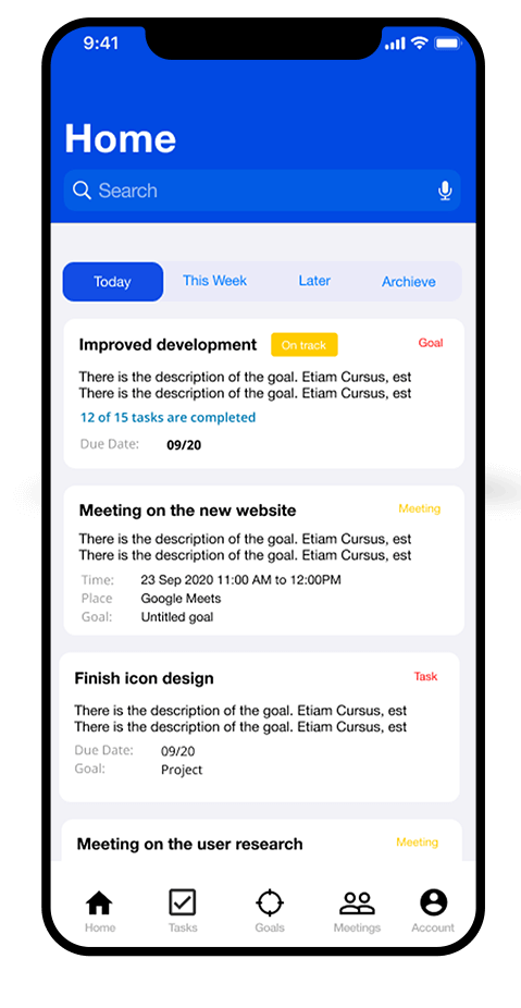
The Home Page displayed all the tasks, goals and meetings in a card-based format. The cards are arranged in a chronological order. Each card contains a description of the task, finish time and a label. It also has information about goal the task is related to. The Goals card has a badge that indicates the status of the goal.
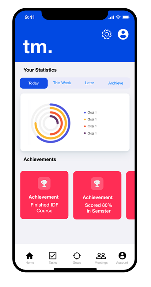
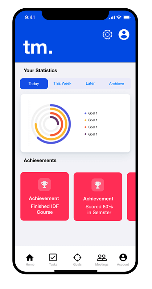
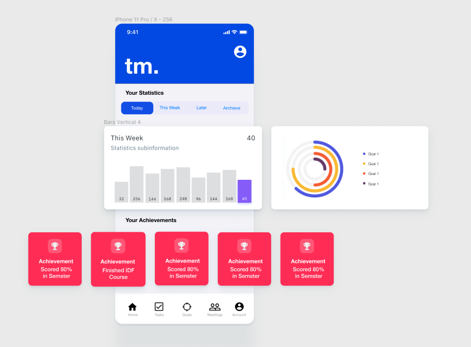
The stats page displays the progress and achievements made by the mentee over the course of the program.
The bar graph shows the progress made by the student over the selected span of time while the circular chart
shows the current status of the targeted goals.
The badges are achieved by the user once an goal is complete. The badges induce a sense of gamification
and keeps the user focused on the goals.
○ Prototype
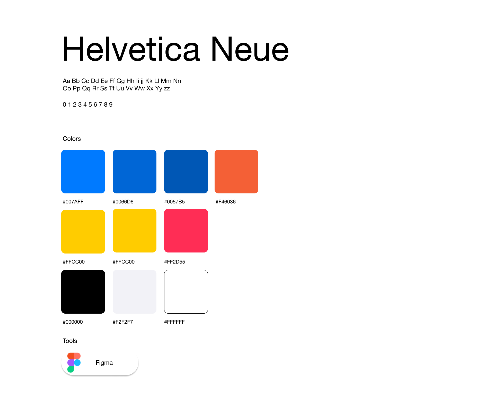
○ Design System
This was my first real project with an industry partner apart from my personal projects. It was a great experience to apply design thinking methodologies to understand the problem and come up with a solution for it.